It’s no secret that there are endless options when it comes to office design. And with each new building going up, the options get even more plentiful. So how do you know you are designing the perfect office space? We’ve got you covered. I’ve pulled together a list of 5 common mistakes made when designing the work space, and how you can avoid making those same mistakes.
Not Using the Right Storage For Your Needs

Storage is an essential part of any office space. It can be used to store file cabinets, books, furniture, and more. But before you start purchasing and installing storage units for your workspace, it’s important to consider the types of needs that each person in your office has—and how those needs vary from one person to another.
Common Storage Mistakes:
- Using too much storage space—or not enough. If you have a large number of employees who deal with confidential information on a regular basis (e.g., lawyers), then providing them with plenty of desk drawers or cabinets may be a good idea for privacy purposes. However, if many people in your office work remotely and only need access to basic materials like pens and paper clips occasionally during their shifts at home or while on vacation, then having excess drawers might make it difficult for employees who want quick access when they’re actually working at the office (and vice versa). In general, there should always be enough drawers available so that anyone who wants them can find some; however this doesn’t mean that every single drawer needs its own dedicated spot!
Underestimating The Importance Of Lighting

The right lighting can make a huge difference in your office, affecting the mood and productivity of your employees. Here are some tips to keep in mind when designing your space:
- Pay close attention to how different areas of your office will be lit and how that light will affect the work being done there. For example, people working on creative projects may want a lot of natural light (good idea), while those working on budgets or spreadsheets may need more artificial illumination (and less sunlight).
- Be sure to use plenty of task lighting where it’s needed—but not too much! This is especially important for computer screens; too much overhead lighting makes it harder for people to see their monitors clearly and can cause eye fatigue over time.
- Incorporating natural light into an indoor space is always preferable if possible; just remember that direct sunlight coming through windows can cause glare on computer screens if you don’t have blinds or shades!
Leaving Out Different Types Of Privacy Solutions

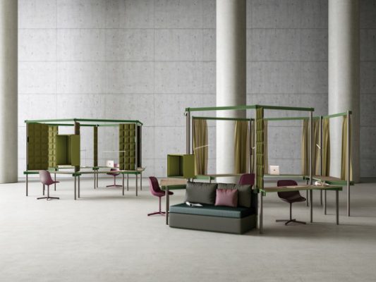
One of the most important things to consider when designing your office space is providing different types of privacy solutions for employees. Whether you’re designing a new office or renovating an existing one, it’s important to think about what privacy needs might arise in the future so you can make sure you have them covered.
While some offices don’t have many privacy concerns and can rely on standard partitions or cubicles, others will find they need something more heavy duty. In those cases, designers should consider adding modular walls that can be easily swapped out if needed.
Even when there isn’t any real need for increased levels of privacy, it’s still a good idea to plan ahead by incorporating some sort of divider into your design plan (especially if it will help you keep costs down).
Paying Too Little Attention To Traffic Flows

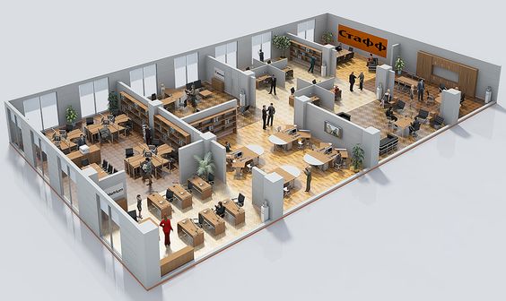
One of the most important considerations for an office design is traffic flow. You want your employees to be able to move around the office with ease, so it’s essential that their path be clear, and that they have visual cues of where they need to go.
There are many different types of traffic flow. Some offices have linear corridors, while others have more circular or branching patterns. Some offices require employees to walk through each other’s cubicles when moving from one area to another, while others allow them to keep a distance between themselves and their coworkers on the same floor or in adjacent towers altogether.
These decisions will all depend on how many floors you’re designing for and how much space each employee needs—do they need personal space? Should there be hallways or not? Are there any security concerns you need to consider? Is any particular kind of furniture going into this building which might affect how people interact with one another within it?
Omitting Some Type of Customer Space

A customer space is any area in your office where you interact with clients. This can be a desk, restaurant seating area, or even an event space. The importance of having a customer space in your office cannot be stressed enough and should not be overlooked when designing the overall architecture of your building.
There are many different types of customer spaces—some more suited to certain businesses than others—and all business owners need to work through which type would suit their needs best.
Read this article to learn about different office design mistakes.
- Document your business processes before you start.
- Think about how you will use the office space.
- Make sure you have enough power outlets and plug points in strategic areas so that no one is ever running out of battery or having to unplug other devices to charge their phone.
- Go for a flexible design that can change as your business grows and evolves, but still allows everyone to feel comfortable in their space.
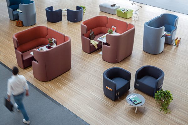
- Don’t forget about break-out areas where people can chat and relax, whether it’s standing up at a standing desk or taking a seat at a table with some colleagues, these are essential!
As you can see, each of the five points we discussed was carefully considered so that your new office space is not only home to your employees, but also creates a positive working environment for them. After all, that’s what the goal of this entire design project is—to create a positive working environment.
